-
Contemporary Cape Cod
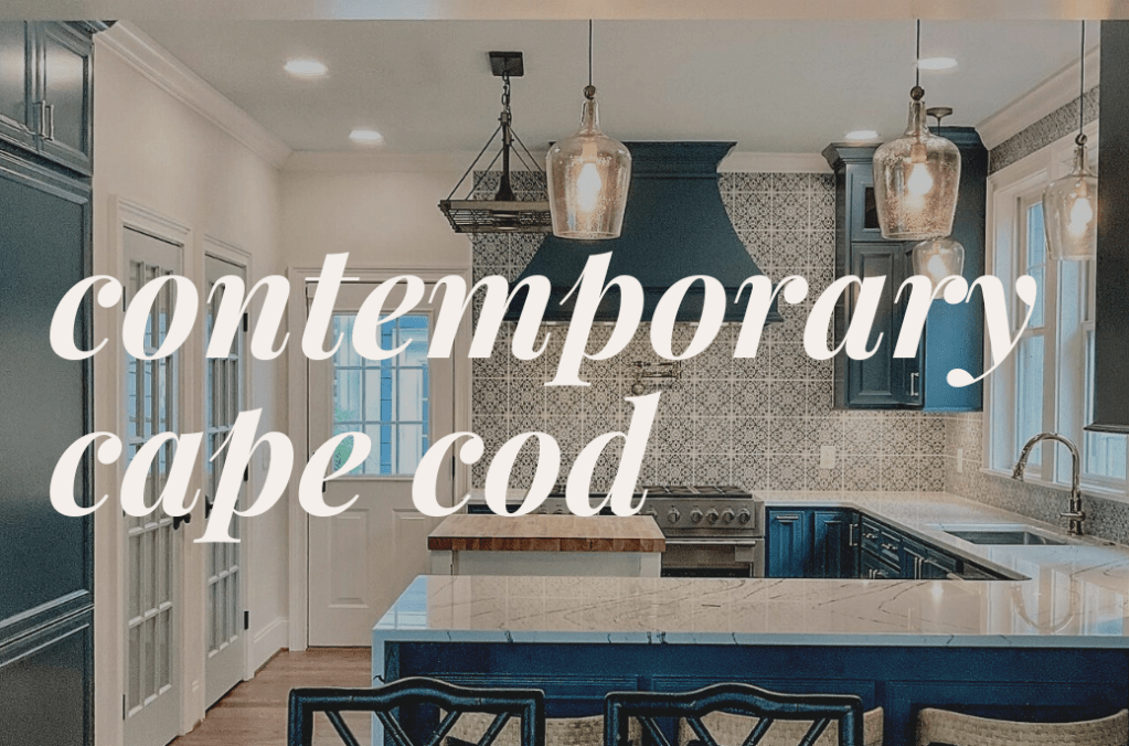
In the world of interior design, the allure of Cape Cod style is undeniable. A contemporary take on this classic New England cottage aesthetic brings forth a delightful fusion of nostalgia, light, and eclecticism. If you’re yearning to infuse your space with coastal charm and warmth, styling a room in the contemporary Cape Cod style…
-
How I Designed My Wedding
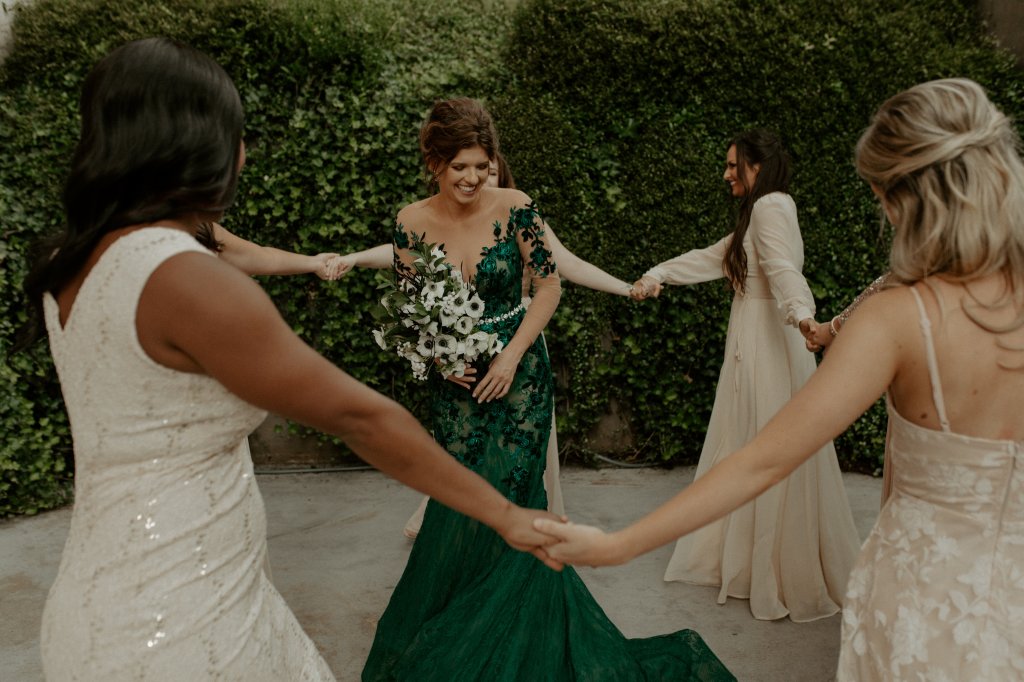
May 30, 2020 was a HIGHLY anticipated day for me. Anyone alive on that day will remember this was right when COVID-19 caused most of the US to shut down, including wedding venues. Our wedding was planned to be held on March, 28, 2020, however we had to cancel our wedding about a week before…
-
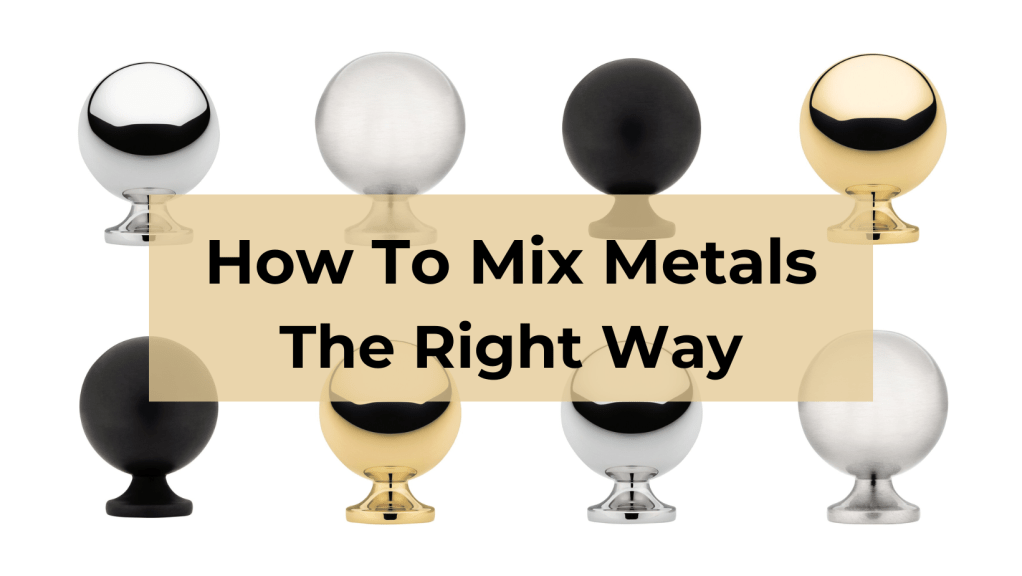
How To Mix Metals The Right Way When it comes to choosing metallic finishes, many homeowners shy away from using more than one metal, yet they want that look! Mixing metals can add emphasis to a piece you want to highlight and visual interest. Light fixtures, faucets, handles, hinges, picture frames, table legs, and a…
-
What’s Hot At High Point Fall 2021
My key takeaway from High Point Market Fall 2021. You’re going to see this everywhere.
-
Decorate Any Room For Fall In 3 Easy Steps
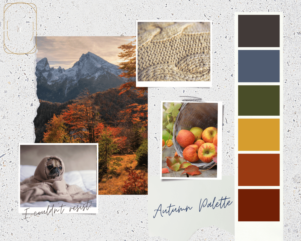
You know you live in South Carolina if you “feel a chill in the air” once the temperature drops to 80 degrees. It’s currently 77 degrees and I’m wearing long sleeves. But hey, I’m not complaining because the climate here in the Upstate provides us all four seasons. Most of us love the Summer time…
-
Check out the recent Redfin article we were featured in.

Working With an E-Designer? Here are 10 Things You Should Know. If you’re looking to try your hand at tackling a full-scale remodel or are looking for ways to give your home a minor revamp, e-design may be the route for you. For starters, e-design is an excellent option for DIY-savvy homeowners or those who…
-
3 Things Your Mood Board Must Have
We’re talking about creating mood boards for your interior design project. When you set out to decorate your room, you may have vision in your head of the style and mood you want to create. An effective mood board exhibits these elements and is a must-have reference tool throughout your design / decorating process. Relying…
-
DIY Curtain Hack
Is it “curtains” or “drapes”? Honestly, most designers and decorators use these words interchangeably. I usually say drapes or draperies, but that’s me being fancy. Use either and we all know what you mean. Custom window treatments bring softness and elegance to a space and make a huge impact in your room. Anything custom comes…
-
Need To Know Interior Design Trends in 2021
With an uptick in remodels and more people staying at home in 2020, the interior decorating game is jumping! If you just redecorated your home, you may want to know if your style is still in. Here are my key takeaways from High Point Market Fall 2020. If you don’t know what High Point Market…
-
Must-Have Black Friday Deals For Interior Designers & Clients

It’s the most wonderful time of the year. It’s time for Black Friday shopping, of course! I have listed my top picks for sales this year for any budget. There any many more shops that are having sales. I have added those I’ve found that offer a higher discounted rate. Don’t forget to support your…
-
Subscribe
Subscribed
Already have a WordPress.com account? Log in now.
